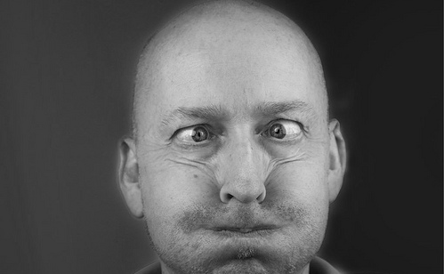
Have you ever had your parent say, “Watch out, or your face could freeze that way”? Or maybe, “Wipe that look off your face”?
Your website header is your online face. Ever consider that? A logo is the centerpiece of most companies’ brand identity, everyone knows that. But when you are an independent self-employed, self-publishing blogger, your website header is the face people see every time they come to read your content.
Marcus Sheridan, the Sales Lion, offers a nice little collection of design inspiration — the headers of 13 popular blogs. While I wouldn’t call them “the best” (there are a LOT of good ones out there!), they are great examples to examine, analyze and emulate.
If you haven’t spent some time and money getting your blog header to truly reflect who you are and what you offer to your audience, then print out his article and take an hour sometime soon to sit down and write down what you want. If you can, sketch it out.
Give yourself a face lift.


1 Comment
Marcus Sheridan · at
Thanks for the mention Teddi, really appreciate that and am so glad you liked the article!
Marcus